Viktoria Urban & Mariandrie Chrysostomou
waveL art
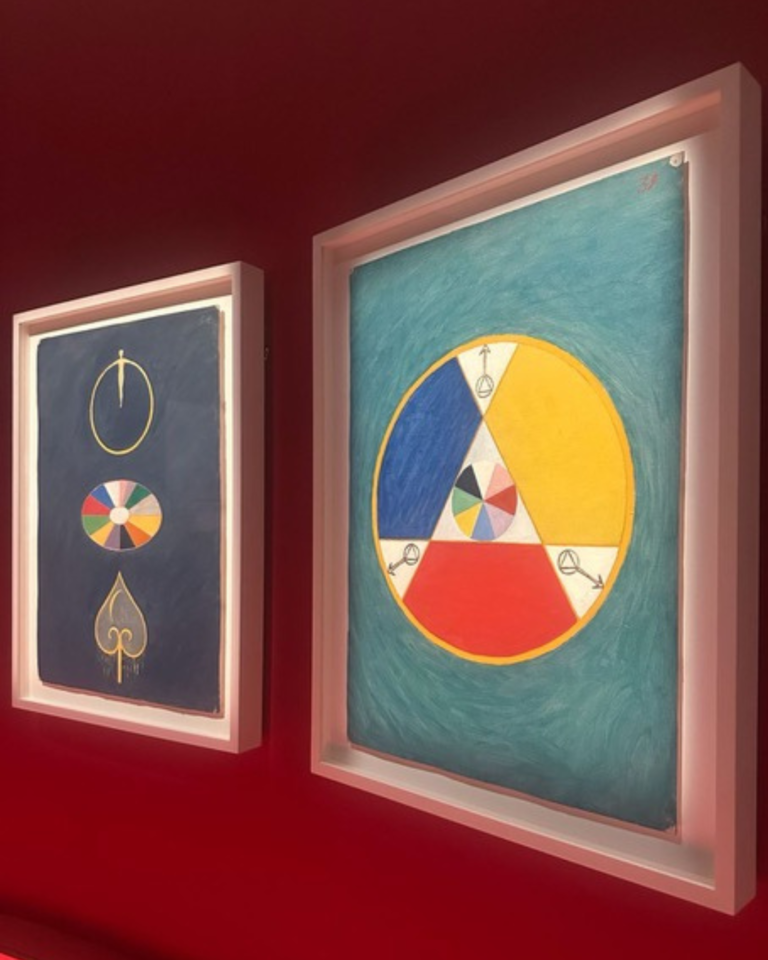
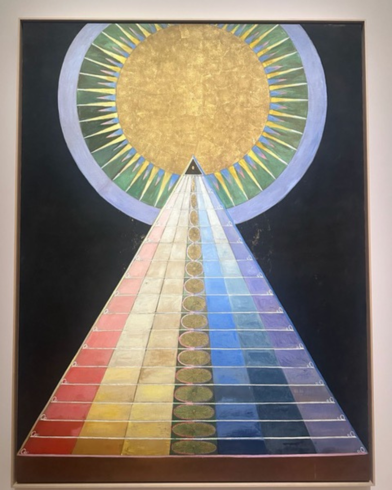
Inspired by our visit to the Grand Palais to see Hilma af Klint: Paintings for the Temple (1906–1915), on view until 30 August, we reflected on the profound impact of colour.
Long before we recognise a subject, understand a composition, or read an artist’s statement, colour has already spoken to us.
It is often the first language of an artwork. Before the mind begins to analyse, colour reaches our emotions. It creates atmosphere, shapes perception, and lingers in memory. Whether subtle or overwhelming, harmonious or confrontational, colour is perhaps the most immediate dialogue between an artwork and its audience.
For centuries, philosophers, writers, and artists have sought to understand its power. While artistic styles, movements, and techniques have continually evolved, colour has remained one of the most potent means of expressing emotion, ideas, and cultural identity. It is never merely decorative. It is profoundly psychological.
Colour affects us in ways that extend far beyond aesthetics. Scientific research has shown that it can influence physiological responses including blood pressure, respiration, muscle activity, cortical activation, and even blinking. Beyond these bodily reactions, colour also shapes our psychological state. Depending on its wavelength, it may soothe or stimulate, reduce anxiety or heighten it, offering experiences that can feel therapeutic, unsettling, or somewhere in between.
The psychology of colour explores how different hues influence human perception and emotion. Although our responses are shaped by personal experience and cultural context, certain associations appear consistently across societies. Blue is often linked with calmness, spirituality, and contemplation; red with passion, vitality, and danger; yellow with optimism, warmth, and energy; while black may evoke elegance, mystery, or mourning.
Warm, luminous colours such as yellow, peach, and pink tend to draw our attention outward, encouraging openness and interaction. Cooler palettes of blue, green, turquoise, and grey often invite introspection and quiet reflection. Light colours are generally perceived as energetic, while darker tones can feel more contemplative or restrained.
Yet art continually reminds us that colour resists fixed definitions.A deep blue may evoke serenity in one painting and profound loneliness in another. White signifies purity in some cultures and mourning in others. Green can suggest renewal and hope as readily as envy, uncertainty, or even fear. Meaning is never inherent in colour alone. It emerges through context.It is precisely this ambiguity that makes colour such a compelling artistic language. Rather than offering definitive answers, it invites interpretation.
In many cases, colour itself becomes the subject. The pioneers of abstraction demonstrated this with remarkable clarity. Piet Mondrian’s artistic evolution, from representational landscapes to compositions reduced to essential forms and primary colours, illustrates how colour can transcend description and become the very foundation of an artwork. Similarly, Mark Rothko’s luminous fields of layered colour abandon narrative and figuration in favour of pure emotional experience. Through subtle tonal shifts and seemingly minimal compositions, Rothko sought to transcend the physicality of the inanimate and offer room to discover the unknown.
Hilma af Klint developed a highly personal chromatic vocabulary to visualise spiritual forces, human evolution, and unseen realities. Standing before her paintings is often described as an emotional rather than an intellectual experience, with viewers frequently speaking of intimacy and spiritual resonance without being able to explain precisely why.
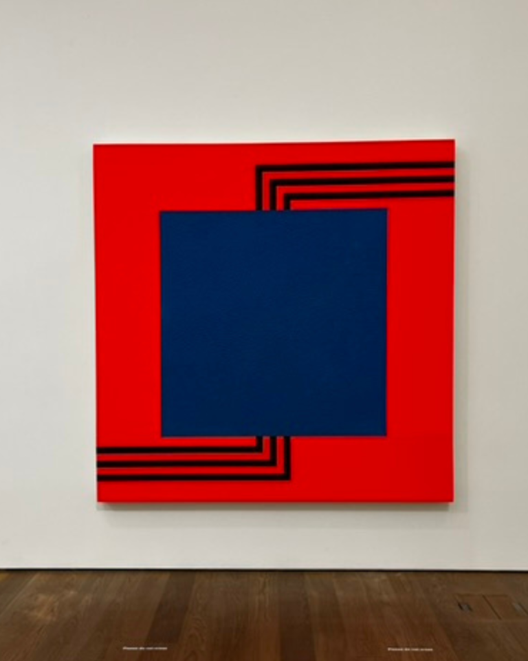
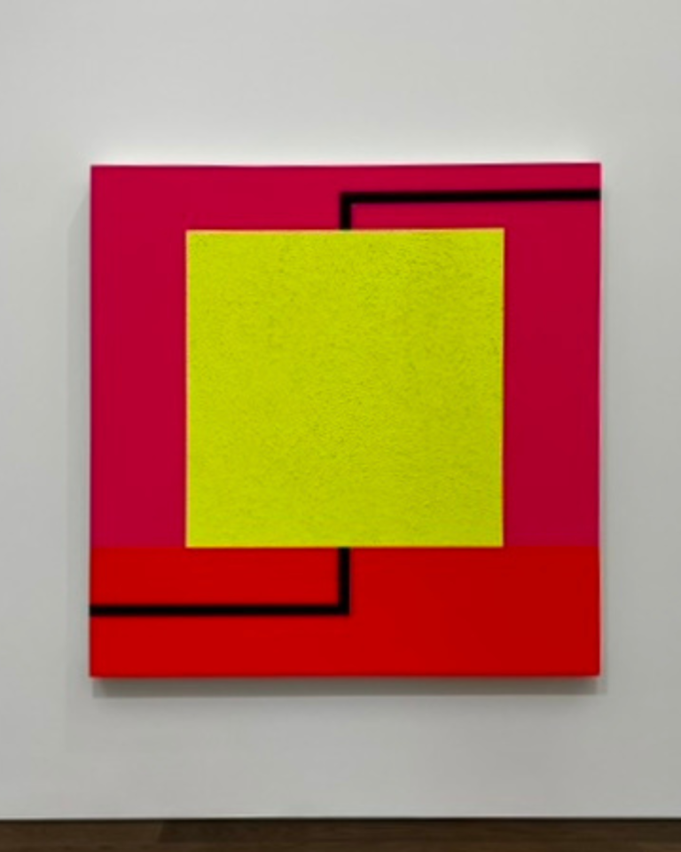
In contemporary painting, Peter Halley’ s fluorescent, synthetic palette has become inseparable from his artistic identity. Instead of pursuing harmony, Halley employs vivid, high-contrast colours to construct visual metaphors for contemporary social structures and systems. Sean Scully’s contemporary abstractions explore deconstruction and subtraction, echoing Mondrian’s investigations while approaching them from a deeply emotional and intuitive perspective, creating tension between order and chaos.In each of these practices, colour moves beyond representation. It becomes atmosphere, emotion, and meaning, prompting reflection not only on the artwork itself but also on our own inner world and the environments we inhabit.
Although colour is most often associated with painting, it has played an equally significant role in sculpture throughout history.
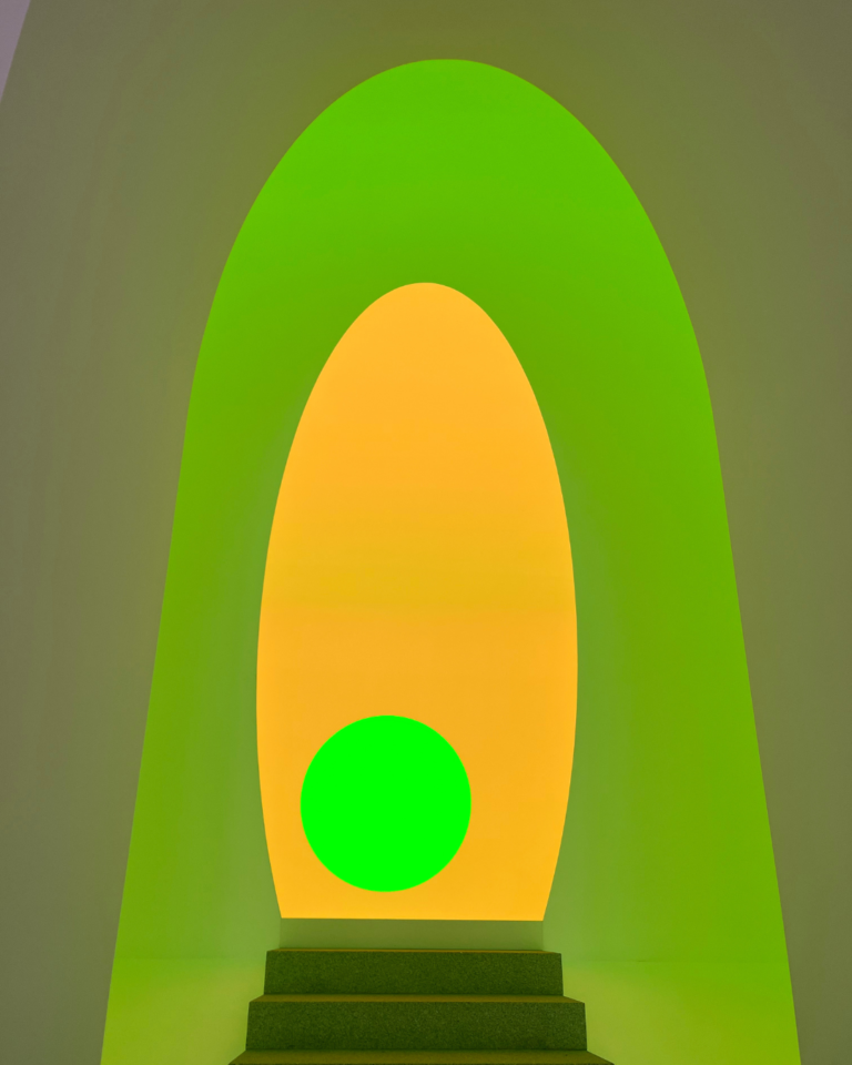
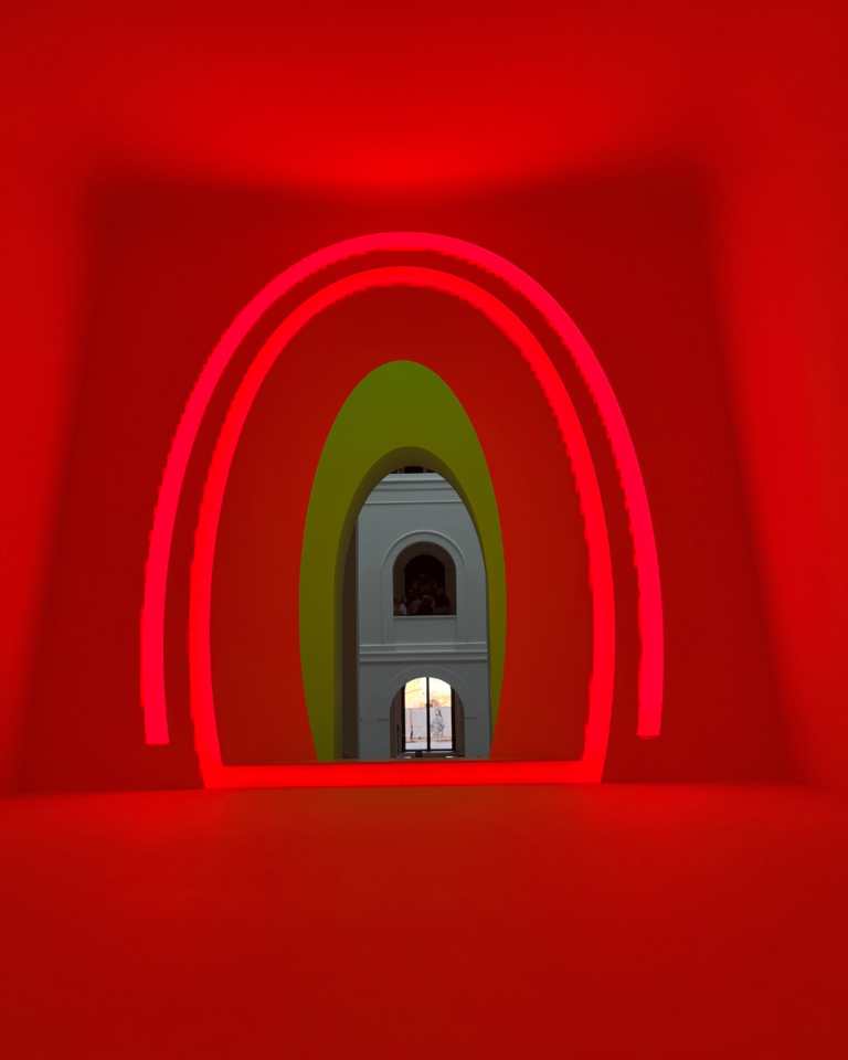
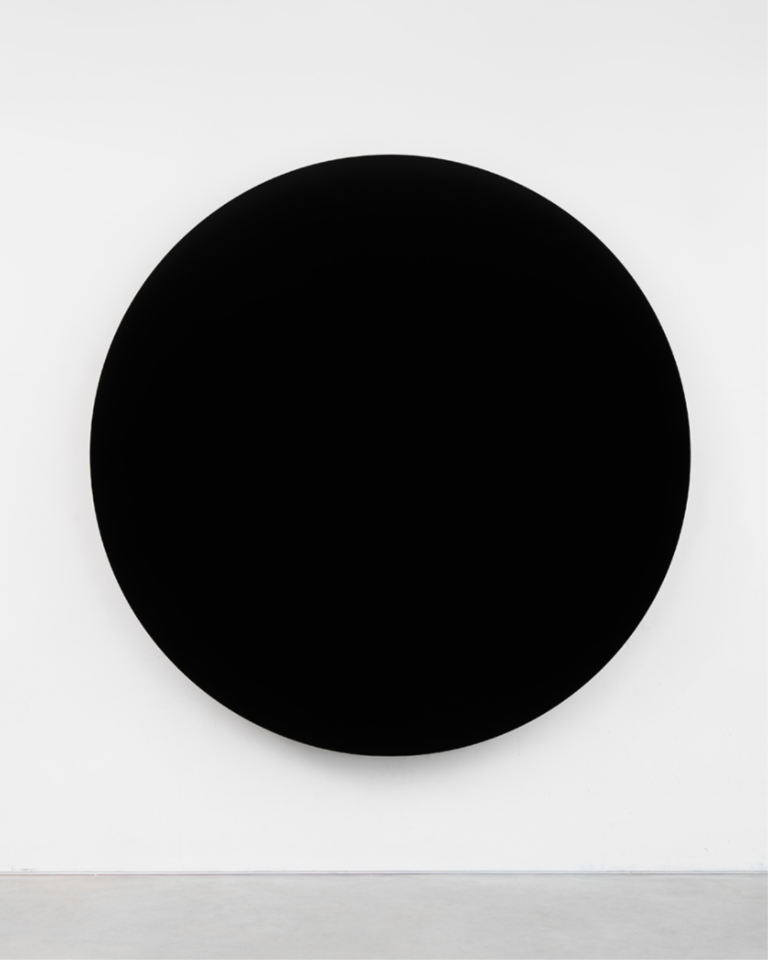
From the polychromy of antiquity to contemporary works artists have long understood that colour transforms the way form is perceived. It alters our sense of weight, temperature, scale, and movement. In much contemporary art, colour extends beyond the artwork itself, creating immersive environments in which visitors become part of the composition. James Turrell, for instance, uses light and colour to dissolve the boundaries between architecture, perception, and space, producing atmospheric installations that often evoke a profound sense of contemplation and transcendence. Similarly, Anish Kapoor employs intensely pigmented surfaces and optical illusions to challenge our perception of volume and gravity. His long association with Vantablack, the ultra-black coating that absorbs almost all visible light, further demonstrates how colour can become a sculptural material in its own right, transforming absence into a powerful visual presence.
Perhaps colour’s greatest gift is that it encourages us to slow down.
We live in a world saturated with images competing relentlessly for our attention. Art asks something different. It invites us to linger. It asks us to experience rather than simply consume.This slower way of seeing reveals that colour is never fixed. It changes with light, distance, surrounding hues, and even our own emotional state. The same artwork can appear entirely different on another day because we ourselves have changed.
Colour becomes less an attribute of the artwork than a meeting point between artist, object, and observer. Its power lies precisely in its openness. Colour does not tell us what to think; it invites us to feel, to question, and to look more carefully. In doing so, it reminds us that some of the most meaningful dialogues in art take place without language at all.